
Designing the campaign system for Hot Sale 2026
The campaign's entire system for Petco Mexico: four landing pages segmented by pet, two offer periods and the component library behind them.
- Role
- UX/UI Designer · end to end
- Period
- May 2026 · published and closed
- Volume
- 8 published landing pages
- Tools
- Figma
Context
Hot Sale is a different way of shopping
Petco Mexico's highest-converting landing page of 2026
Hot Sale isn't a regular purchase with a discount: it's a different mode of behavior. Users arrive with limited time —they know the window is closing, so they don't explore, they execute—, comparing actively —they have other tabs open, and the decision isn't “do I buy or not” but “here or there”— and afraid of missing out.
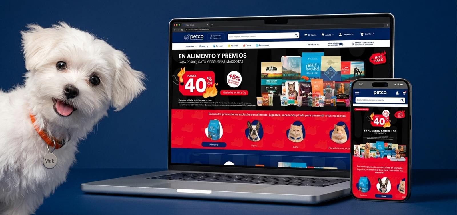
I designed the campaign's entire system for Petco Mexico: four landing pages segmented by pet type, each in two offer periods, plus the component library behind them. Eight landing pages published at 1728 px, the largest production volume of the year.
Empathize
Users aren't learning: they're locating
“In a limited-time campaign, users aren't learning, they're locating. They don't want the value explained: they want to confirm in under three seconds that the offer applies to their pet and find the shortest route to the product.”
It's the exact opposite of the insight behind an editorial category landing page, and it explains why this piece is so different from the rest of the portfolio: it doesn't argue, it signals. The promotion isn't explained, it's repeated — the same differentiator banner appears three times on a single page, with no argument in between.
Define
Confirm in three seconds that the offer is for their pet
The primary point of view was: a pet parent who arrives during Hot Sale with a purchase intent already formed needs to confirm immediately that the promotion applies to their type of pet, because they're comparing against other retailers in parallel tabs and will leave if they have to search.
How might we help each type of pet parent recognize their offer on the very first screen?
How might we shorten the path from “landing page” to “product in cart” as much as possible?
How might we give unconventional pets their own entry point without building a separate campaign?
Ideate
Four landing pages instead of one
The highest-impact decision was structural: four landing pages instead of one. I evaluated three paths, and the two cheap ones failed for the same reason — they forced users to filter before seeing their offer, one step too many in a context of urgency.
Single landing page with filtersDiscarded — forces filtering before seeing the offer
One URL, one thing to maintain, concentrated SEO
Single landing page with anchorsDiscarded — a giant page with a diluted differentiator
Cheap, with in-page navigation by section
Four landing pages + switcherChosen — removes the self-selection step
Every user lands on 100% relevant content, and it enables media segmented by audience
With four segmented landing pages and a persistent switcher between them, the self-selection step disappears: users don't filter, they arrive already filtered from the media channel. The cost is four times the production work, which is why the campaign relied on a single banner template and its own component library.
Blocks by offer period
Instead of editing a live campaign, I built two complete, independent blocks —May 25 to June 2 and May 29 to 31—, isolating each offer period.
Single banner template
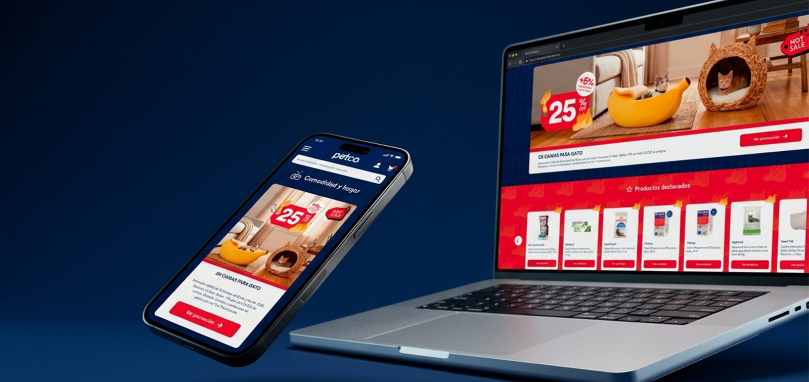
One component handles every banner across the four landing pages: an image slot plus a bar with title, legal copy and CTA. Two themes by two heights.
Image treatment
I tested three levels of background saturation —Saturated, Light and Ultralight— looking for the point where the product reads clearly without the campaign red losing impact.
The system
A three-beat rhythm, repeated three times
The whole page boils down to a three-beat rhythm repeated three times with different offers. There's no argument between blocks, no educational content, no storytelling: it's the structural signature of the piece and the first thing to preserve in the next campaign.
Differentiator
Banner with the offer percentage
Route to product
Featured brands or carousel
Objection remover
Interest-free installments, payment methods, 24/7 support, returns
Repeated three times per page, with different offers and no argument between blocks.
Campaign hero
The maximum differentiator on the first screen: up to 40% off plus an extra 5% for every $1,000, with the Hot Sale seal. It's the first thing deal hunters compare against other tabs.
Pet switcher
Food · Dog · Cat · Small pets, persistent across the four landing pages. It's the piece that turns four standalone pages into a navigable system.
Featured brands
A direct route for those who arrive with a brand already decided —WholeHearted, Blue Buffalo, Acana, Orijen—, which is exactly how planned restockers behave.
Interest-free installments band
3, 6, 9 and 12 interest-free monthly installments mid-page. It's the first objection remover and it tackles what really stops a high-ticket purchase: the amount, not the interest.
Payment methods and 24/7 support
Card, cash, Oxxo Pay, PayPal and Petco Pay, plus a support phone line throughout the event: human backup at a moment of high anxiety.
Return guarantee
Risk reversal right before the exit. It closes the credibility objection, the most common one during the event.
Petco Zoo
The most distinctive bet: a full landing page with sub-navigation for four species —mammals, birds, reptiles and fish— for a category that goes underserved the rest of the year.
SEO block
Campaign copy with internal links by category at the bottom, for indexing and long-tail navigation.
Results
The highest-converting landing page of the year
The result is solid, but repeating it takes one more step: knowing which decisions produced it. Hot Sale on its own brings traffic with intent already formed and unusually deep promotions, so the challenge isn't proving it worked but identifying which part of the design should be kept and which was neutral.
published landing pages
segments by pet type
independent offer periods
differentiator banners per page
The file comes with a free quasi-experiment: four simultaneous landing pages, same traffic, same period, very different structures and lengths. Comparing across them does isolate the design variable.
Length vs. conversion
Cross the conversion and scroll depth of the four landing pages against their height. If Cat (11,340 px) performs as well as or better than Petco Zoo (7,122 px), length has no ceiling; if it performs worse, there's a cutoff point worth knowing before Buen Fin.
Switcher performance
Percentage of sessions that use it to change landing pages. Low usage confirms the media segmentation was right; high usage means users are manually correcting where they landed.
CTR by banner position
Compare the three banners on the same page. If the third performs close to the first, the repetition is justified and gets systematized. If it drops, about 3,000 px of page can be recovered.
Petco Zoo
Its relative conversion and ticket determine whether the dedicated entry for unconventional pets returns in the next campaign.
Measurement to instrument from day one: views per block, switcher clicks with origin and destination, banner clicks with their position, brand clicks, carousel interaction and scroll depth — plus the landing page identifier on every event. Without that field, comparing the four landing pages, which is the analysis that gives the whole campaign its value, can't be done.
Playbook
What gets systematized for 2027
The deliverable that outlives the campaign isn't the eight landing pages: it's the structure that produced them. This is what gets systematized for Buen Fin and Hot Sale 2027.
Segmentation by pet from the moment of landing, with a persistent switcher between landing pages.
The three-beat rhythm —differentiator, route to product, objection remover— repeated.
A single CTA across the whole campaign: “See promotion”.
The three objection removers in this order: interest-free installments, payment methods, 24/7 support.
Risk reversal before the close with the return guarantee.
SEO block at the bottom with internal links by category.
A dedicated entry for unconventional pets.
Independent time-based blocks for each offer period.
Single banner template: image slot, bar with title, legal copy and CTA.
Thanks for watching!
See another project?