
Redesigning Petco Chile's home page to route, not to advertise
The petco.cl home page as a deliberate evolution of Mexico's: a page built so every visitor finds their route, not to advertise.
- Role
- UX/UI Designer · end to end
- Period
- September 2026
- Starting point
- Petco Mexico's home page
- Tools
- Figma
Context
A routing home page, not a sales page
Petco Mexico's home page was where the project started: I compared it against twelve international competitors —Chewy, Petco US, PetSmart, Zooplus, Fressnapf and Pets at Home, among others— and that produced a three-sprint roadmap. Chile came later, with an advantage: a full site restructuring already underway, which made it possible to implement that roadmap in one go instead of in patches.
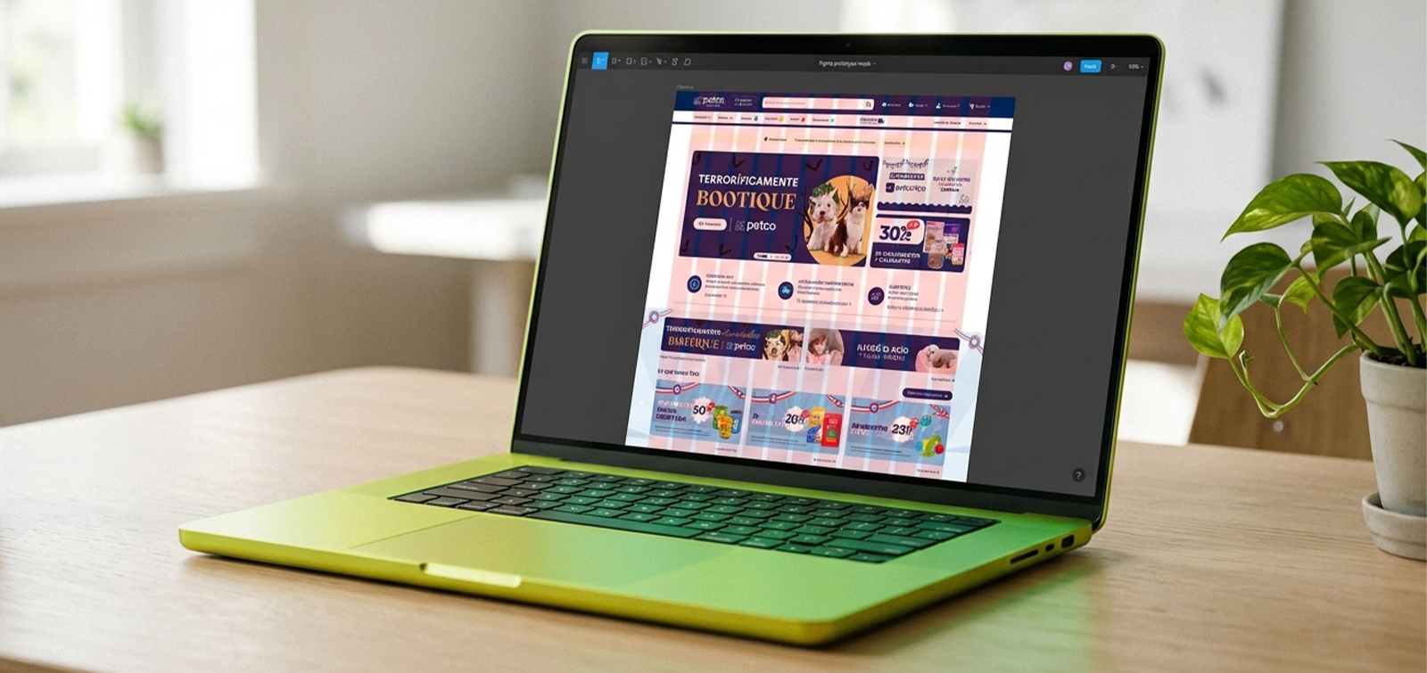
Both sites share platform, catalog and visual system; what changes is the architecture of the entry page. The petco.cl home page —1728 px wide and 6,600 px tall— tackles the three priorities the benchmark left: the hero, a value proposition bar, and surfacing the species selector and services.
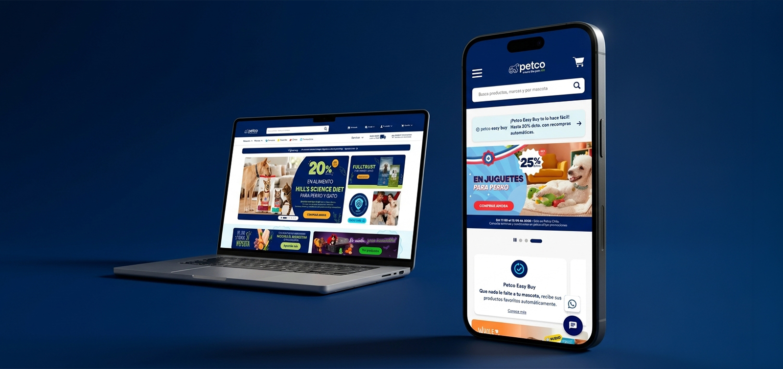
The home page isn't a sales page, it's a routing page. Almost nobody buys from it: the decision made there is where to go in, and there are three possible paths.
I know what I want
Searches or goes straight to their category. The home page just has to stay out of the way.
I'm here to see what's new
Needs to see promotions and new arrivals quickly.
I'm not sure this site is for me
Needs to confirm there's something for their pet, that it ships to their address and that they can return it if something goes wrong. It's the most neglected case and the one with the most at stake in a new market.
Empathize
What changes the design in Chile
Geography rules
Delivery by comuna —Chile's municipal districts— is the first question Chilean online shoppers ask, and it decides whether the purchase happens at all.
The online channel is younger
Trust signals carry more weight: guarantees, payment security and returns.
Operations have their own rules
A free-shipping threshold in Chilean pesos, delivery Monday to Saturday and exclusions by category.
The project's biggest gap: there was no qualitative research with Chilean users. The foundation is the international benchmark, analytics from Mexico's home page as a comparable baseline, and Chile's internal search data.
Define
The higher up, the more navigable
“The home page isn't a storefront, it's a switchboard. Its job isn't to sell: it's to help every type of visitor identify their route within the first two screens. Anything that takes up the top of the page without helping visitors branch off takes something away.”
That led to the principle that orders the whole page: the higher up, the more navigable and the less decorative.
The primary point of view was that visitors need to identify their route within the first two screens, because they don't come to read the home page: they come to leave it for wherever they're headed. Four more were added —the owner of unconventional species, Chilean logistics, the new customer who needs reassurance, and the person looking for a service rather than a product—, each with a design decision and a way to verify it.
How might we make the top of the home page help visitors branch off, not just advertise?
How might we show several offers at once without making users wait for a carousel to rotate?
How might we answer “does it ship to my comuna?” before users have to look for it?
How might we sustain a home page that's re-skinned every month without redesigning it each time?
Ideate
Five decisions that set it apart from Mexico's
Five decisions separate this home page from Mexico's. The first and most visible was the hero: I evaluated three ways to show the commercial offer without a carousel imposing its pace on users.
Full-width carouselDiscarded — only one offer visible at a time
Fits everything the commercial team wants to announce
Single static heroDiscarded — unworkable with the commercial teams
Maximum clarity and speed
Showcase with two fixed side panelsChosen — with a pause control
Three messages visible at once: the main one rotates and the sides don't
The detail that makes the showcase work is the pause control, in addition to the indicators: users can stop the rotation on the offer they care about. It's the difference between a carousel that imposes the pace and one that hands it back. The side panels were reserved for permanent acquisition messages —the app download with 10% off the first purchase and a discounted category— instead of more rotating campaign content.
Value proposition bar below the hero
Three promises with icon, text and link on the first scroll: Petco Easy Buy, delivery Monday to Saturday with times by comuna, and Club Petco. Recurrence, logistics and loyalty solved in 159 px; the delivery block answers the comuna question before users ask it.
Species selector in the body of the page
“Who's your best friend?” with nine entries: Dog, Cat, Mammals, Birds, Fish, Reptiles, Pharmacy, Outlet and New. In Mexico, species only live in the menu; for a reptile or bird owner, the difference between “it's in a menu” and “it's on the page” is assuming the site isn't for them or confirming that it is.
Services and reassurance with their own space
Grooming and Adoptions as two large cards mid-page, where users are already exploring. The guarantees band —returns, warranty, free shipping in Santiago on orders over CLP $29,990 and secure checkout— sits right before the footer, where visitors decide whether they'll come back or leave.
The home page as a kit, not a page
This page is re-skinned every month, so the library doesn't store September's blocks: it stores the possible grids, with 2- and 3-column layouts, image variants and x1, x3 and x4 banner modules. Whoever builds October's home page picks a grid and fills it in, without redesigning. It's probably the most valuable long-term decision.
The page
Eleven blocks, none repeated
Eleven content blocks in just over four and a half screens, with no repeated section. The order follows a journey: the home page opens by resolving transactional intent, answers entry objections, opens up exploration routes and closes by building a relationship.
Navigate
Showcase and promotions
Trust
Value proposition and logistics
Explore
Categories, species, services and life stage
Return
Blog, customer gallery and guarantees
Each block appears only once: nothing repeats.
| Dimension | Mexico home · starting point | Chile home · September 2026 |
|---|---|---|
| Hero | Full-width carousel | Pausable showcase with two fixed side panels |
| Value proposition | Scattered or missing above the fold | Three-pillar bar below the hero |
| Species | Only in the header menu | Row of nine visible entries |
| Services | Behind a menu item | Their own block mid-page |
| Logistics | Not shown on the home page | Delivery and times by comuna above the fold |
| Guarantees | Mostly in the footer | Dedicated band before the footer |
| Social proof | — | Gallery with photos of Chilean customers |
| Maintenance | Redesign for every campaign | Configurable grid kit |
Fixed blocks that don't get touched: value proposition, species selector, services, guarantees and footer. They're the structure, not the campaign.
Re-skinnable blocks: showcase and side panels, seasonal band, promotions, featured brands, blog and gallery.
Length rule: the home page doesn't grow from month to month. If a block comes in, another goes out; 6,600 px is the agreed ceiling.
One grid per block: a column variant is chosen instead of building something custom.
Measure
Two markets, one platform
The prototype is built to answer one concrete question: does a home page built to route —rather than to advertise— improve exits toward categories and services compared with Mexico's model?
international competitors in the benchmark
content blocks on the home page
entries in the species selector
agreed length ceiling
The project's advantage is that Chile and Mexico run the same platform with different home page architectures, which allows comparison under reasonably controlled conditions. For that, every event is instrumented with the market as a parameter: without it, comparing the two home pages —the project's biggest analytical asset— can't be done.
- H1
The showcase with side panels generates more total clicks than a full-width carousel.
- H2
The value proposition bar reduces early abandonment.
- H3
A visible species selector increases traffic to unconventional species.
- H4
The services block generates demand for grooming and adoption from the home page.
- H5
The grid kit reduces the time it takes to build each monthly home page.
An honest caveat: Chile and Mexico aren't equivalent populations —different channel maturity, different catalog, different media investment. The comparison guides; it doesn't prove. For firm conclusions, the clean test is an A/B test within a single market.
Next steps
What goes back to Mexico
Four moves from this version can be brought to Mexico's home page without depending on the Chilean restructuring, in order of increasing effort.
Value proposition bar below the hero.
Guarantees band before the footer.
Species row in the body of the page.
Showcase with side panels and a pause control instead of the carousel: the highest-impact change and the only one that requires development.
Now
Instrument events with the market parameter and establish Mexico's baseline before Chile builds up history.
Coming weeks
A moderated test with five Chilean users without an existing account: find something for a rabbit, confirm delivery to a comuna outside Santiago, book a bath and resolve a return.
Next quarter
With three months of data, decide which of the four moves are brought to Mexico.
Thanks for watching!
See another project?