
Redesigning the purchase decision for cat litter
An editorial category landing page for Petco Mexico that gives criteria before the product listing: it reframes the purchase from bag price to real monthly cost.
- Role
- UX/UI Designer · end to end
- Period
- 2026
- Type
- Existing product improvement
- Tools
- Figma · Design System
Context
A frequent purchase decided by the price of the bag
Cat litter is a frequent, low-involvement replenishment purchase that is highly sensitive to shelf price. Cat parents compare bags in the aisle —or in the product listing— by price and weight, not by how long they last. The commercial consequence is a mix skewed toward the budget tier and a short repurchase cycle that cat parents themselves see as normal.
I designed an editorial category landing page for Petco Mexico, 1728 px wide and 6,908 px tall, built on components that already exist in the design system. It isn't a deals page: its job is to give people criteria before they reach the product listing.
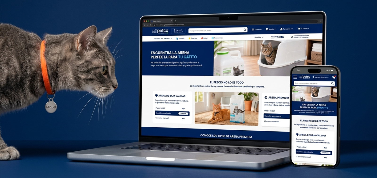
The mockup was built from category and business knowledge.
Empathize
Cat parents optimize the wrong variable
“Cat parents aren't choosing badly out of carelessness: they're optimizing the wrong variable. They compare the price of the bag, when the variable that drives both their spending and their odor experience is how long the litter lasts before a full change.”
Primary POV — the repeat buyer
Rebuys every one or two weeks and compares by bag price: overpays without noticing and lives with a litter box that smells too soon.
The first-time cat parent
Doesn't know litter types exist, so has nothing to choose by.
The one who already tried switching
Tried a different litter and their cat rejected it; switching now feels risky.
The senior cat's parent
Their cat has a history of urinary issues and needs health information before product.
Define
Compare by monthly cost, not bag price
It isn't a catalog problem or a pricing problem. It's a unit-of-comparison problem. That led to the point of view that governs the whole page: a cat parent who rebuys litter every one or two weeks needs to compare litters by monthly cost and duration, not by bag price, because they overpay without noticing and live with a litter box that smells sooner than it should.
How might we make the real monthly cost as visible as the price of the bag?
How might we give choice criteria to someone who doesn't know litter types exist?
How might we remove the perceived risk of trying a different litter?
Declared risk: the landing page's entire argument rests on premium litter having a lower real monthly cost. If transactional data doesn't support it, the Define phase falls apart and the problem has to be reframed.
Ideate
Four directions, one editorial contrast
For the main question I evaluated four directions. The interactive calculator was the most persuasive, but it required high development and data-maintenance costs, and validating the premise first. The spec-table comparator was precise and complete, but dense and hard to scan.
Interactive calculatorDiscarded — high cost and an unvalidated premise
The most persuasive and personalized
Spec comparatorDiscarded — dense and hard to scan
Precise and complete
Two-scenario editorial contrastChosen as the backbone of the page
Reframes the variable in three seconds
Performance label on the cardAdopted as reinforcement
Carries the learning to the moment of purchase
I chose the two-scenario editorial contrast because it reframes the variable in three seconds without asking for any interaction, and I adopted the performance label on the product card as reinforcement: it carries the learning over to the moment of purchase.
Prototype
From criteria to product, in eight modules
The page moves from reframing → taxonomy → personal criteria → hard data → risk reduction → backing. The product always appears after the criteria that justify it, never before.
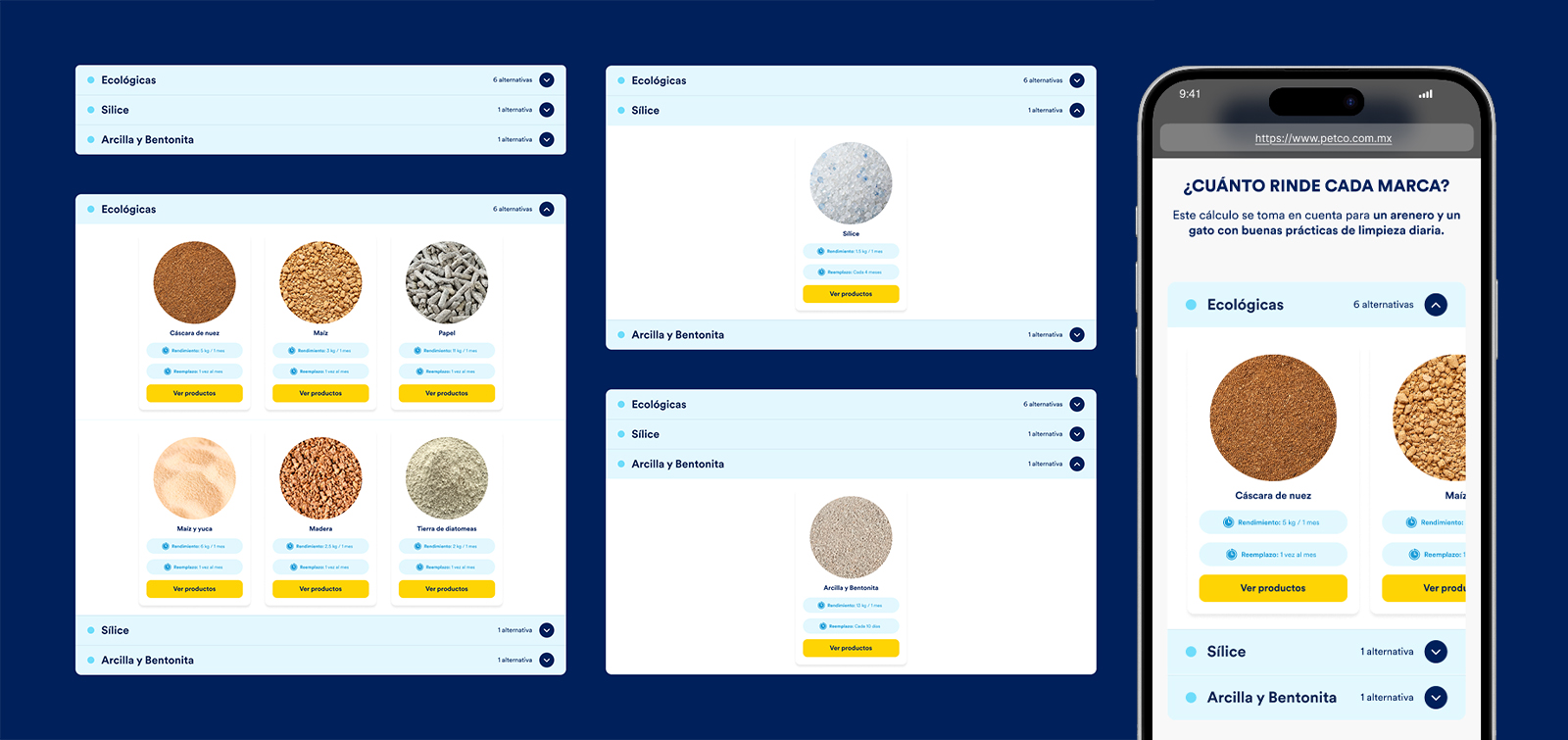
The anchor module is the performance accordion: it's where the hero's promise becomes a number cat parents can check at home. Everything else exists so that, by the time they get there, the number means something.
Price isn't everything
A binary contrast between low-quality and premium litter across three identical attributes. The “approximate duration” row is highlighted on both cards: it tells readers which variable matters.
Get to know premium litter types
A three-block taxonomy —clay and bentonite, silica gel, eco-friendly— before any brand is mentioned.
Things to consider
Eight self-selectable factors (multi-cat home, life stage, coat type, respiratory sensitivity, environmental impact…). Cat parents build their own profile without filling out a form.
Get to know each type in depth
Tabs with three variants; each one delivers a definition, five benefits with icons and a carousel of five products. Depth on demand.
How long does each brand last?
An accordion with concrete, verifiable data —yield in kg per month and replacement frequency— so the page isn't flooded with figures.
Urinary health
Education about pH and blood in urine first, product second. The monitor's three states carry a text label in addition to color.
Gradual switch in 3 steps
Risk reduction right before the close. It's the module with the most reuse potential: it already lives on at least two landing pages and should be promoted to a design system pattern.
Guarantees
Commercial backing —100% satisfaction and expert advice— that closes the price objection.
Measure
A prototype built to answer one question
This piece is a high-fidelity prototype with no connected interactive flow, and it's designed to answer one concrete question: does reframing “bag price” as “monthly cost” shift cat parents' stated preference toward a higher-yield litter?
modules on the landing page
directions evaluated
cat parents in the moderated test
tall, at 1728 px wide
The plan is a remote moderated usability test with five cat parents who bought litter in the last 30 days —two with one cat, two with several cats and one who already tried switching and failed—, with tasks framed as scenarios and a closing question asked without the page in view. That last answer is the real measurement of the main hypothesis.
| Level | Metric |
|---|---|
| On page | Scroll depth to the performance accordion and open rate |
| Conversion | CTR to the listing and to the product page |
| Business — the one that matters | Change in the category's premium vs. budget mix for users exposed to the landing page |
| Business | Average category ticket and 60-day repurchase frequency |
| If the test shows… | Then |
|---|---|
| Nobody reaches the performance accordion | Back to Prototype: move the data higher up the page |
| They still choose by bag price | Back to Define: the POV doesn't describe their real decision |
| They open the accordion but the data means nothing to them | Back to Ideate: the data's format is the problem, not its position |
If traffic goes up and the mix doesn't move, the page is being read but it isn't working. That's the difference between a landing page people like and one that changes a purchase decision.
Assumptions
What the mockup still assumes
The yield figures are commercial claims customers can verify: they must be validated with the category team before publishing.
The accordion's counts assume a litter-type → SKU mapping that must come from the catalog, not from the mockup.
The urinary health block has clinical implications: it requires veterinary review and probably a disclaimer.
Featured products are static in the mockup; in production they come from the catalog with availability logic.
Thanks for watching!
See another project?